I don’t think I’d ever heard of the annual National Youth Tobacco Survey (NYTS), conducted annually by the Centers for Disease Control and Prevention (CDC). But in 2018 it crashed into my life, as someone who had finally been able to quit smoking after 10 years, through the use of nicotine vapes.
That was the year that Scott Gottlieb, then commissioner of the Food and Drug Administration (FDA), responded to the NYTS data by announcing that youth vaping was an “epidemic.” This pronouncement threw vaping into the headlines, making it Public Enemy Number One as panic over youth use exploded. A rash of restrictions and bans have followed.
Since then, I’ve made it my personal mission to scrutinize the data from this survey in order to effectively advocate for the products that saved my life.
This year’s release of NYTS data brought some of the worst and most inaccurate reporting I’ve ever seen.
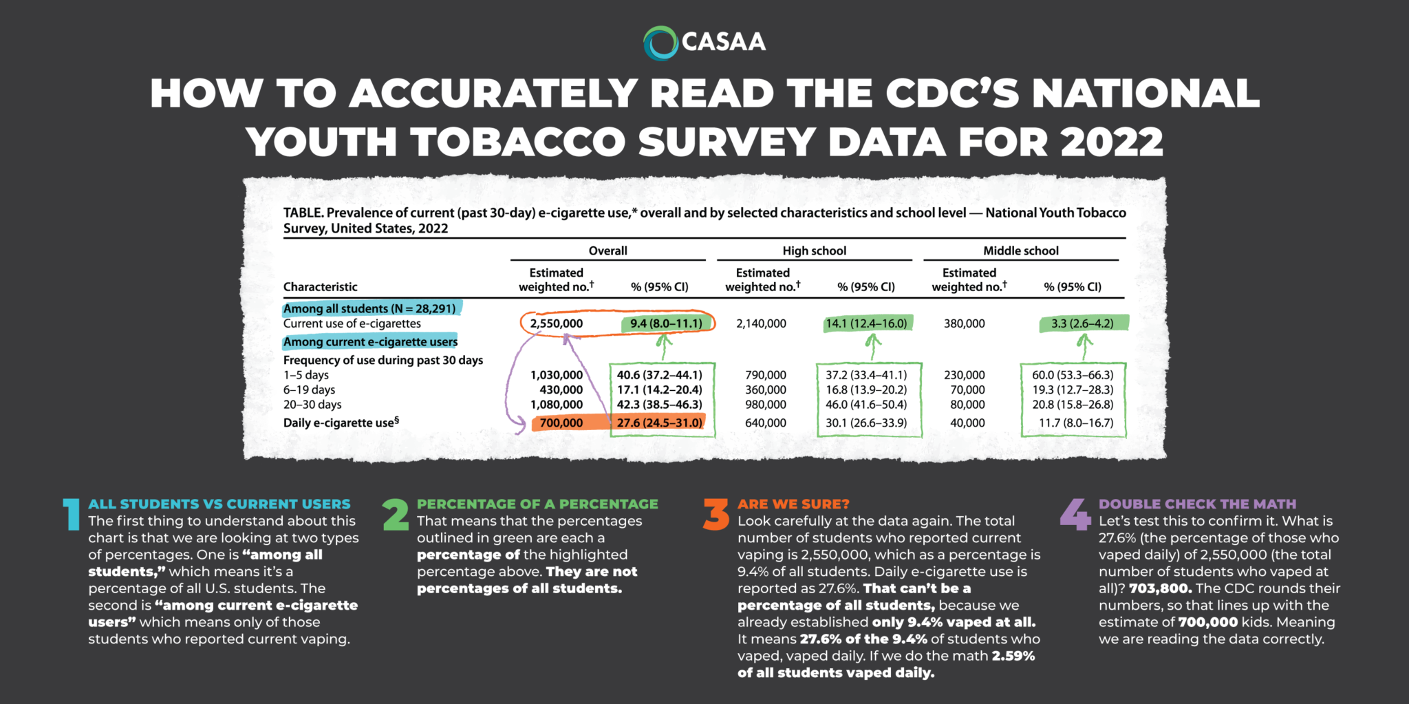
Over the years, I’ve noticed a fundamental misunderstanding of the NYTS data—largely due to how they’re presented—by politicians, medical professionals, media and the general public alike. This year’s release of NYTS data brought some of the worst and most inaccurate reporting I’ve ever seen, with numerous media outlets reporting, for example, that “more than 1 in 4 teenagers used electronic cigarettes daily.”
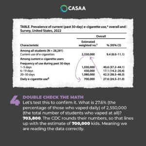
That statistic is dead wrong. What the data actually show is that 2.5 percent of youth used e-cigarettes daily, not over 25 percent.
How could news outlets mess this up so badly?
Looking at how this information is presented by the CDC, the source of the error is not hard to comprehend. The CDC states that more than one in four teenagers who reported using e-cigarettes used them daily. Clearly, that is nothing like one in four teens nationwide.
The practice of reporting percentages of percentages may be common among academics and researchers, but the average American just expects to be told a flat rate. In order to understand what percentage of all teens are truly vaping daily, you need to do your own math—a necessity for which most people are not prepared, and which would be avoided if the CDC simply did it for us.
I wonder why it doesn’t?
In response to Filter’s request for comment, a CDC spokesperson said, “It is not really percentages of percentages. It is important to note that prevalence is a ratio and not a rate, therefore it is measuring proportions (presented by a percentage). Prevalence refers to proportion of persons who have a condition or behavior at or during a particular time period and the denominator is set to those who are at risk for the condition.”
Asked if the CDC was aware that its presentation of data often results in confusion among the media and the public, the spokesperson said that “we work to ensure that our communication materials are as clear and informative as possible, while accurately reflecting our data and findings. If we find, or are made aware of inaccuracies in the public use of CDC data, we follow up with the users of that data, provide clarity as appropriate, and request that corrections are made.”
“If they are presenting frequent use as a societal problem, then the proportion of kids vaping daily is more relevant than the proportion of teen vapers vaping daily.”
However, Clive Bates, the former director of Action on Smoking and Health (UK), told Filter that he disputed how CDC was defining “prevalence,” clarifying that it can be defined with “reference to any total population,” and noting that it is the “responsibility of the writer to be clear and to avoid confusion.”
“If they are presenting frequent use as a societal problem, then the proportion of kids vaping daily is more relevant than the proportion of teen vapers vaping daily,” he said.
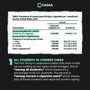
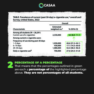
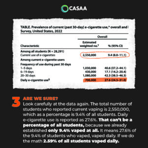
So in an effort to clear up this confusion, and to help people—especially journalists—understand how to accurately report these statistics, I created a visual explainer and tutorial (above and below) on how to read the CDC’s data.
My hope is not only that this will prevent inaccurate and hyperbolic headlines (and perhaps even result in some corrections), but that it will also spur people to pressure the CDC to present each year’s NYTS data in a more readily comprehensible manner.
Feature graphic and infographics by Danielle Jones
