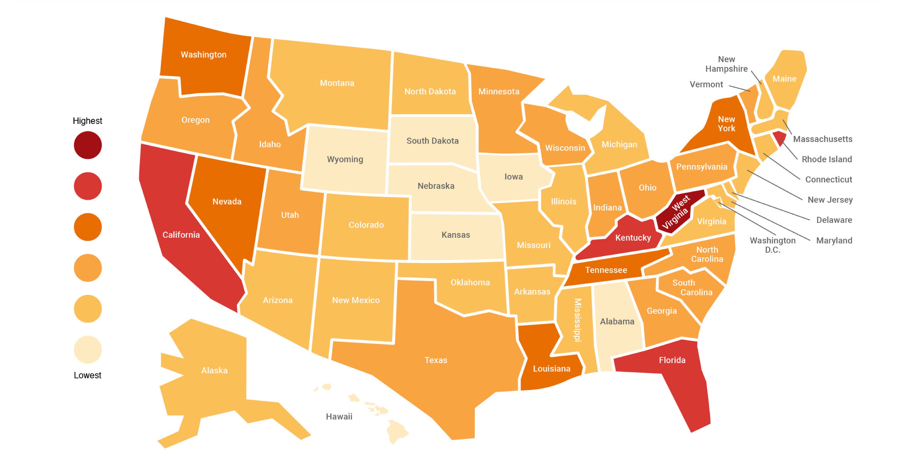
The state-by-state concentration of health insurance claim lines associated with opioid “abuse” and dependence is visualized in the above infographic by FairHealth—a nonprofit that aims to increase transparency in healthcare finances and data collection.
It represents the percentage of opioid-related claim lines–including methadone administration, psychotherapy, inpatient treatment services such as sub-acute detoxification, intensive outpatient services, and emergency department services, among others–out of each state’s total claim lines from 2017.
Some of the opioid-issues hotspots represented on the map—Appalachia, Florida, New England—will be familiar to those who have followed the overdose crisis. California scores highly, too, although as Travis Lupick recently reported for Filter, the nature of the state’s heroin market has so far minimized fentanyl-related deaths there.
Supporting data are drawn from FairHealth’s August 2018 white paper, “Opioid Abuse and Dependence: A National Tapestry of Care and Cost With a State-to-State Analysis.” The interactive version of the infographic, when clicked on, displays breakdowns of state data, including diagnoses by age and gender.
FairHealth’s data set has limitations—notably, that opioid issues are measured by access to health care, which often precludes people who are poor or undocumented. Another perspective is provided by SHADAC, a multidisciplinary health policy research center, which also presents an interactive state-by-state map—this time of prescription opioid painkiller (oxycodone and hydrocodone) sales in kilograms per 100,000 people. Their data provides insights into supply and, by implication, the possibility of accessing such opioids.


Show Comments